Each of our Colours of the Year from the past two decades tells the story of a moment in time. Carefully selected using global insights and the expertise of our colour specialists at the Global Aesthetic Center, they offer us a window into the changing sentiment of the age. Over 20 years, we’ve seen a dramatic shift towards neutral, natural colours – a trend that reaches a pinnacle this year with a ColourFuturesTM story that is inspired wholly by nature.
It is well known that what happens in society influences our opinion about how we live in the build environment and our homes. For a paint manufacturer like AkzoNobel it is very important to know in advance which colours people will like in the future. Each year AkzoNobel’s Global Aesthetic Centre invites an international group of design and trend experts to come together and discuss and forecast colour trends otherwise known as the Colour Futures project. What follows is the journey trends have taken from 2004 to 2023. Apart from five/four dominating trends, every year, one central idea is identified that connects these trends:
2004 BALANCE
In 2004, the central theme was balance, reflecting the modern urban professional’s need for relaxation and highlighted the prevalence of aqua blue.
2005 VITALITY
2005 was all about vitality, living life to the fullest and soaking up different cultures with the bright optimistic oranges as the focal point.
2006 RESTORATIVE
In 2006, the forces of nature like hurricane Katrina sobered our mood as a whole with a tendency towards restorative yellow and neutral tones.
2007 URBANISATION
In contrast the 2007 pallets of intense urban colours, showcasing a masculine cool pink, reflected worldwide creativity in innovation.
2008 GLOBALISATION
Globalisation and China’s rise to economic and Olympic superpower status pushed Imperial yellow into the spotlight in 2008.
2009 RESPONSIBILITY
2009 was a pivotal year with global economic turmoil forcing us to reassess our aspirations. Jade green perfectly captured this mood.
2010 RECLAIM
As 2010 sailed into view, the effects of the credit crunch was visible. The need to reclaim the control of our lives was symbolised by a clear light blue.
2011 APPRECIATION
The first rays of hope returned an appreciation of what we had in life translated into a friendly sunshine yellow in 2011.
2012 POSSIBILITIES
In 2012, our renewed confidence built a world of possibilities. Red, symbolizing energy and urgency, was the colour that clearly expresses this.
2013 CONNECTIONS
Blue as the colour of communication and trustworthiness, the indigo blue of 2013 underlines the idea of network and dialogue, a greater understanding, and the importance of worldwide connections.
2014 UNLOCKING POTENTIAL
By looking at what’s fresh in 2014, we can unlock the potential that is around us, teal green is chosen for versatility and universal appeal. Teal is a gentle yet sophisticated blue-green that could be used as a richer alternative to turquoise.
2015 EVERYDAY +
For 2015, the overriding mood is one of both searching for and finding that extra which makes the difference to our lives. After years of pro-actively looking for, connecting and un-locking our potential, 2015 is about that added refinement: putting the + into the everyday. It’s about finding the wonderful in the normal: the magic in the everyday.
By exploring under-utilized spaces, as well as our relationships both with each other and with our environment as a whole, we are learning to look at the world around us in new and unique ways. We are finding new, subtle ways to add colour to our lives, with a renewed emphasis on developing a more caring, sharing environment for all. Sustainability is now a requirement rather than a preference; and it needs to be backed up by genuine commitment. It’s a reaction against consumerism; a celebration of difference and the wisdom to be found in unique, individual stories.
Copper Orange, Copper Blush conveyed a heartfelt optimism with its warm, encouraging tones that play into the theme of ‘Everyday Plus’.
2016 LOOKING BOTH WAYS
This year, we find ourselves at a unique crossroads in time. We are at a interesting point where we can see the advantage both of tradition and also of modern innovation, where the importance of weighing up opposite opinions and views has never been stronger. Digital and modern techniques are here to stay but we look for inspiration from the past to be able to design for the future. This theme of duality is the driving influence for 2016.
For instance, we live in overcrowded urban areas where we lack darkness during the night, yet research shows that we need the dark. Similarly, we live structured lives but need to escape the grid to remain ourselves, or for example technology is now so much a part of our lives that we enjoy a printed book or pencil and paper. Opposites are seen in all our trends–Heritage and Future, Dark and Light, The Grid and Letting Go and Words and Pictures.
Ochre Gold: This year Cherished Gold offered consumers vibrancy and earthiness in equal measure – a perfect epitome of the ‘Look Both Ways’ theme.
2017 LIFE IN A NEW LIGHT, things that make life worth living.
We yearn for connection, simplification, recognition, a slow pace of life and sharing, for simple, restful colors we understand and recognize.
Colors that have a history and a meaning, that works without effort. A color that is soothing and restful. Blue is the Color of life; it’s the ink we write with, the clothes we wear, the sky we gaze at, the water that revitalizes us and the flowers that make our world brighter. Blue is always there in every aspect of our lives, in the past, the present and it’s still there in the future.
Denim Drift is a timeless and versatile blue that takes on a different characteristic depending on the light, color combination and situation. The grey-blue depth of Denim Drift defined the ‘Life in a New Light’ theme, with its qualities of clarity and timelessness.
2018 A WELCOME HOME
As life gets faster, now is the time to choose to press pause. As we find ourselves part of more conversations, we need to give ourselves permission to take a step back. Our home needs to be a place where we can turn down the noise, where we can nurture our values and recharge. This can be our sanctuary where we can all look forward to… A WELCOME HOME
Heart WoodTM references the tactile qualities of natural wood and has a soft pink tone that captures the essence of ‘A Welcome Home’
2019 LET THE LIGHT IN
People are feeling energized and ready for action. We want to create a space that reflects a sense of awakening and that embraces our new spirit of positivity. We want homes where we can turn our thoughts and dreams into actions, where we can invite others to join in, where we can… LET THE LIGHT IN
This years CoY, SPICED HONEY is inspired by the varied tones and properties of honey and truly reflects the optimistic mood of ‘Let the Light in’. Truly versatile and contemporary, our Colour of the Year for 2019 complements a broad spectrum of life and interiors styles and is the ideal choice for reflecting our new sense of optimism.
Spiced HoneyTM has a warm amber tone that perfectly captures our ‘Let the Light in’ theme. It can be calming and nourishing, or more stimulating and energising, depending on the light and colours surrounding it.
2020 THE HUMAN TOUCH
We are looking for a place where we can contemplate our future, consider our purpose in this brave new world. Where we can better connect with our friends and family, our surroundings, with nature. Where we can express ourselves, be ourselves. We are looking to give our homes…“The human touch” Our CoY2020 is a soft, fluid shade reminiscent of the colours of the morning sky. It perfectly encapsulates our desire to treasure our most human qualities. Its effect changes depending on the colours it is used with, making it a beautiful versatile shade that gives our homes ‘The human touch’.
Tranquil DawnTM has an air of calm and clarity that perfectly reflects our theme. Inspired by the dawn horizon, it is a delicate, fluid shade that sits somewhere between green, grey and blue.
2021 THE COURAGE TO EMBRACE CHANGE
When times are changing and the world seems unstable, we want to feel the ground beneath our feet. We need to take comfort in the stability of the simple things around us – the resilience of nature; the solidity of the earth; the sanctuary of our homes. This year, we’ve chosen a natural, neutral Colour of the Year that can give us a strong foundation. An empowering, earthy colour, evoking stability, growth and potential, it helps create an environment that gives us the courage to embrace change.
Brave GroundTM is a bolstering, balancing shade that connects us back to nature and the simple things. A warm, natural neutral, it allows other colours to shine and provides a firm foundation for living. An empowering, earthy colour, evoking stability, growth and potential, it helps create an environment that gives us the courage to embrace change.
2022 A BREATH OF FRESH AIR
We’re at a turning point. The effects of a global pandemic have shone a light on all aspects of our lives – social, economic, environmental – and acted as a catalyst for new ways of thinking. The need for a life audit has suddenly been supercharged, as we’ve come to a deeper understanding about what really matters to us and the wider world. After a spell of feeling shut in – both literally and metaphorically, we also crave expansion – the great outdoors, the open air, a sweep of limitless sky. We want to feel released and revitalised; to look out and bring in new ideas, a bright outlook and flashes of joy. As the clouds clear, it’s time for a fresh approach to everything.
Bright SkiesTM is an airy, light blue that’s fresh, open and good for the soul. Reflecting the limitless skies around us, it brings a hint of the natural world inside and can bring any living space to life. It’s also a colour that works with a host of other shades – from soft neutrals to joyful brights.

2023 SEEDS OF WONDER
The humble seed is the magician of the natural world. Designed to fly with the wind, to grow with the rain, to feed the little plant it contains, it’s a mighty resource in a tiny skin; a transformation waiting to happen. We’ve taken Seeds of Wonder as our theme this year to inspire you to capture the magic of nature and bring it into your home. Just as one tiny seed turns into a towering tree, so the kernel of a decorating idea can become something wondrous and change the way you feel. Itʼs all about feeling the magic of nature and bringing it into our homes.
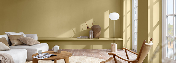
Wild WonderTM is a positive, glowing and natural tone that, by connecting us with the natural world, can help us feel better in our homes.
And so the story continues. Let’s see what 2024 will bring…


