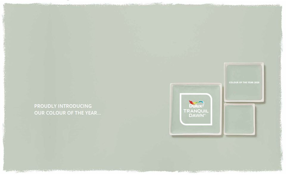
DULUX COLOUR OF
THE YEAR 2020
"Every year, our colour specialists work with design experts from all over the world to get a clear understanding of the upcoming global trends that will shape our lives. We use these insights to identify our Colour of the Year. This year’s shade, Tranquil DawnTM, has an air of calm and clarity that perfectly reflects the mood of 2020. It’s a beautifully versatile shade that changes depending on the colours it’s used with. We’ve created four stunning palettes around Tranquil Dawn which we’ll explore in these pages. You’ll also find lots of inspiring tips and ideas to help you use these beautiful new colour combinations on your walls. We hope you have fun discovering the perfect look for your home.” Heleen van Gent
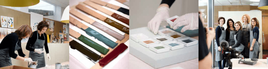
2020’s new colour palettes began their journey at the AkzoNobel Global Aesthetic Center in Amsterdam. For more than 25 years, this has been our studio for trend analysis, colour design and art direction. Led by Creative Director Heleen van Gent, the creative team supports 80 markets around the world in empowering consumers and customers to choose paint colour palettes for their homes with absolute confidence. In order to deliver beautiful new colour palettes that are perfectly matched to consumers’ desires and lifestyle needs, we continually monitor social, cultural and design trends as they emerge all over the globe, gathering unique insights via an international team of design experts. Our colour team then uses this information to help identify the Colour of the Year and create four inspiring palettes around it. ColourFuturesTM is central to the Global Aesthetic Center’s work. It allows us to tell the stories behind this year’s colours, and create a wealth of content to meet the needs of the media in passing these trends and palettes on to consumers. In tandem with our colour forecasting work, the team creates an array of assets, including hundreds of compelling images that demonstrate how the colour palettes will translate into real people’s homes, all over the world.
THE 2020 MOOD…….
This year, it’s all about WHAT MAKES US HUMAN. Last year, we wanted to “Let the light in” to our lives. And, in 2020, light and clarity are needed more than ever, as we look to new horizons and ask ourselves, what does it mean to be human? People are keen to examine their values and bring new meaning to everyday existence. In an increasingly digitised, superficial world, our global trend research suggests that people are experiencing a desire for positive real-world connections and relationships. We want to take care of ourselves, of each other and the natural world, to learn about our heritage and rediscover lost skills. We feel the need to make room in our lives for joyful and unexpected experiences, for awe and wonder.
HOW THIS TRANSLATES INTO OUR CUSTOMER’S HOMES
They are looking for a place where they can contemplate their future, consider their purpose in this brave new world. Where they can better connect with their friends and family, their surroundings, with nature. Where they can express themselves, be themselves. They are looking to give their homes….”The human touch”…
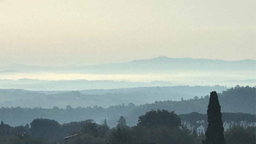
OUR INSPIRATION FOR COLOUR OF THE YEAR 2020….NEW DAWN
We are at the start of a new decade, a new dawn. The world is full of possibilities which is why our colour team, when choosing a shade that brought to life our desire to treasure our most human qualities and give our customers homes ‘The human touch’, looked to the soft, fluid colours and tranquillity of the morning sky for inspiration…
“THE DULUX COLOUR OF THE YEAR FOR 2020 IS INSPIRED BY THE CALMING TONES OF A MORNING SKY” Heleen van Gent
Feeling inspired? Find out more about Tranquil Dawn here